Figures
I spend a lot of my time thinking about how to communicate the results of my work. A lot of this centers around visual communication—figures. My typical process starts by developing a base figure using R, then cleaning up and annotating it in Adobe Illustrator.
Below are examples of some figures I have created, with design rationales and captions from the corresponding paper (if applicable).
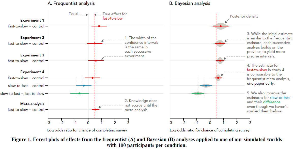
Frequentist/Bayesian forest plot
This figure compares the results of analyses of successive simulated experiments using either a frequentist or Bayesian approach. The "true" (simulated) effects are shown for comparison. The goal was to contrast worldviews and to visually emphasize the narrowing of estimates in the Bayesian world (on the right) compared to the frequentist one (on the left). Annotations walk the reader through the salient points in the visualization. For more details see my CHI 2016 paper.
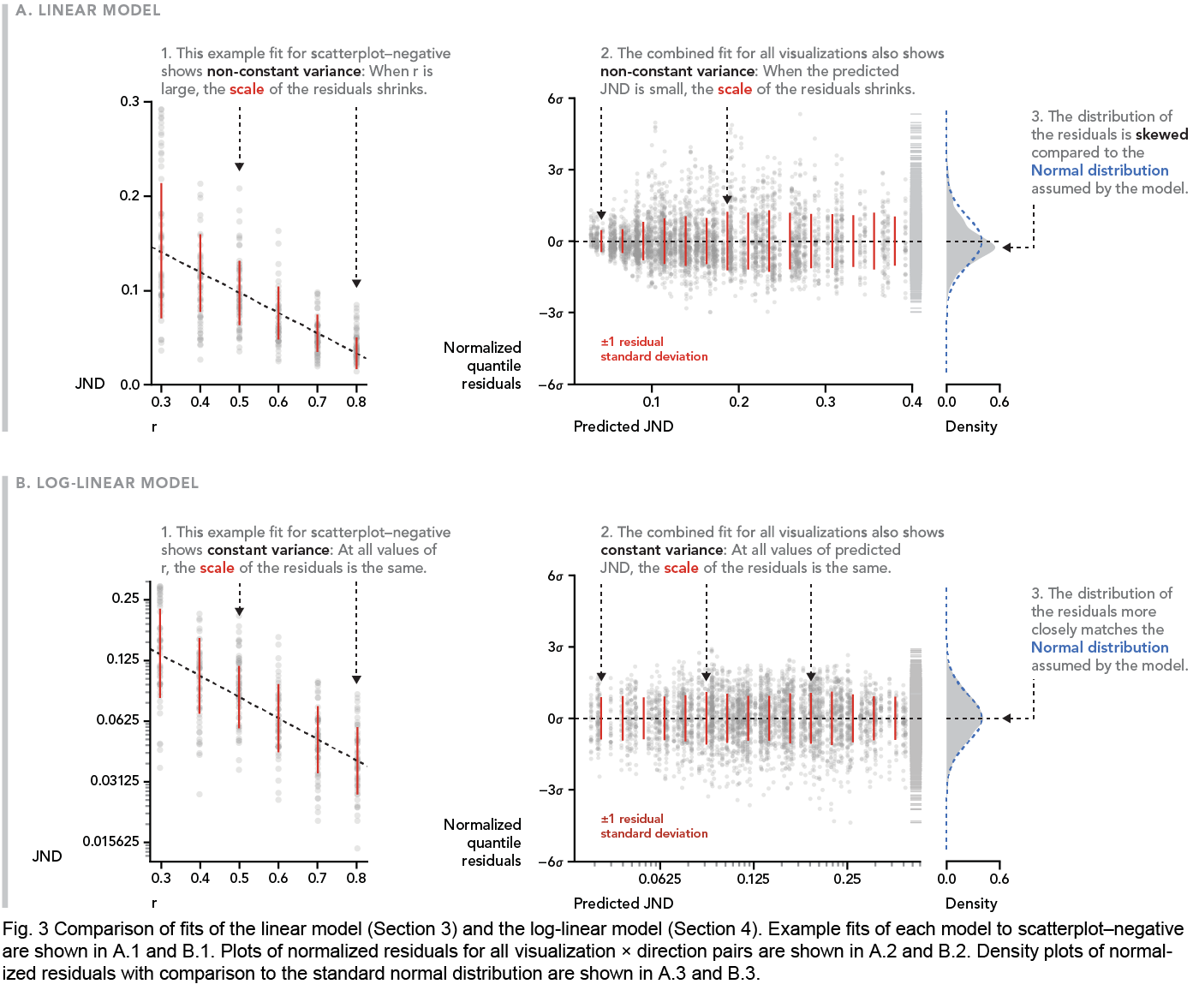
Linear and log-linear model comparison
This figure, from my InfoVis 2015 paper Beyond Weber’s Law, acts as a visual tutorial on the basic assumptions of a linear model (and their violations): constant variance and normal residuals. It does this first through describing the non-constant variance of residuals within a single condition, introducing the reader with a straightforward example by plotting residuals against a predictor in panel 1. It uses this to scaffold an understanding of a more general and useful view of residuals in panel 2: plotted against the predicted response for all conditions. A marginal plot of the distribution of the residuals then makes the final connection to the shape of the residual distribution. Then, we repeat the whole process again with a proposed improved model.
Color is used to directly and implicitly refer to relevant parts of the visualization within annotation text, making potentially complex references clear and succinct—without the need for more explicit legends or additional annotation. Thus, the narrative flows linearly.
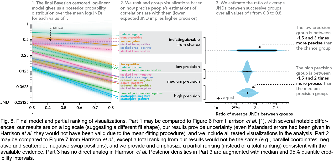
Final model from Beyond Weber’s Law
This figure shows the final model from Beyond Weber’s Law. The intention of this figure is, beyond communicating model fit, to make several contrasts with Harrison et al. This includes a visualization of error in the model fit lines in panel 1, a partial (rather than total) ranking in panel 2, and an estimate of differences between groups in panel 3. This approach emphasizes uncertainty, and tries to guide the reader through a measured interpretation of the results given the precision of the model estimates.
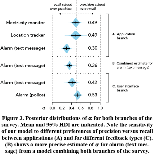
Precision/recall tradeoffs in acceptability of accuracy
This figure shows estimated preferences for precision versus recall from How Good is 85%? Each estimate corresponds to a trade-off between preference for precision or recall by users of a given application. To ease interpretation, how the parameter of interest—α—maps onto this tradeoff is directly indicated above the horizontal axis.
This figure also employs (what I call) eye plots for results from a Bayesian model—a combination of a point estimate, 95% credibility interval, and posterior distribution. This can be compared to a confidence interval but with higher resolution of uncertainty. Variations on this are called eyeball plots, raindrop plots, and violin plots in the literature. The variant I employ is also inspired somewhat by Kruschke's posterior density plots. I call them eye plots since they are distinct from violin plots of data, and unlike eyeball or raindrop plots they include a point estimate and interval (giving a complete “eye” and not just the “eyeball”).